Uber Money
The Brand Experience team was tasked with defining the strategy, marketing, and product experiences of Uber's first fintech app—Uber Money.
Uber Money's vision was to amplify the financial opportunity of the earners on its platform. Earners (i.e., drivers and couriers) wanted more transparency and control over their money. My team conducted interviews with earners globally, distilled these findings into an appropriate business strategy. Then translated these goals into a holistic customer experience across physical and digital touchpoints. We worked closely with Peter Hazelhurt's product team every step of the way.

Marketing Strategy


How do you translate “Amplify Opportunity” into a design system?
Uber Money exists across Uber's entire product ecosystem. There was already a complex system of colors and symbols throughout various loyalty programs. So we chose to represent this program with a finish, not a color. That finish we called Amplified Reflection.
We used the reflectivity of light to represent opportunity, amplifying the colors from the context of the image. This created an optimistic color schema that we used during signature moments of the customer journey. Below is the tool we created to generate the texture of the system.

Photography
Uber’s photography system makes use of natural light and effects, so for Uber Money, we used in-camera methods of finding ways to carry that same reflected optimism into the photography.

Illustration
Uber’s illustration system is modular and simple. For Uber Money, we used transparency and overlay to tie back to the concept of amplified reflection.

Typography & Symbol
We already had the stellar typeface—Uber Move—created in collaboration with Wolff Olins and MCKL type foundry. For Uber Money we commissioned Jeremy again to create a mono weight to help make the readability of financial information as clear as possible. The Uber Money symbol below was created by my team.


Product (WIP)
When translating the brand strategy into Uber Money's product experience, we did so to enhance the product experience based on the insights we had discovered during the research phase. Using visual and verbal design, we designed key flows of the experience to connect emotionally with our Earner customers.
Celebrating Opportunities
Its important to make sure a creative concept doesn’t get in the way of good usability. “Amplify Opportunity” here was translated by means of using typographic scale to celebrate and empower a customer’s financial accomplishments.
Tone of Voice
Products often overlook the importance of verbal identity in their experiences. We wanted to make sure we infused the copy with an optimistic tone that celebrated the opportunities of Uber’s earners.
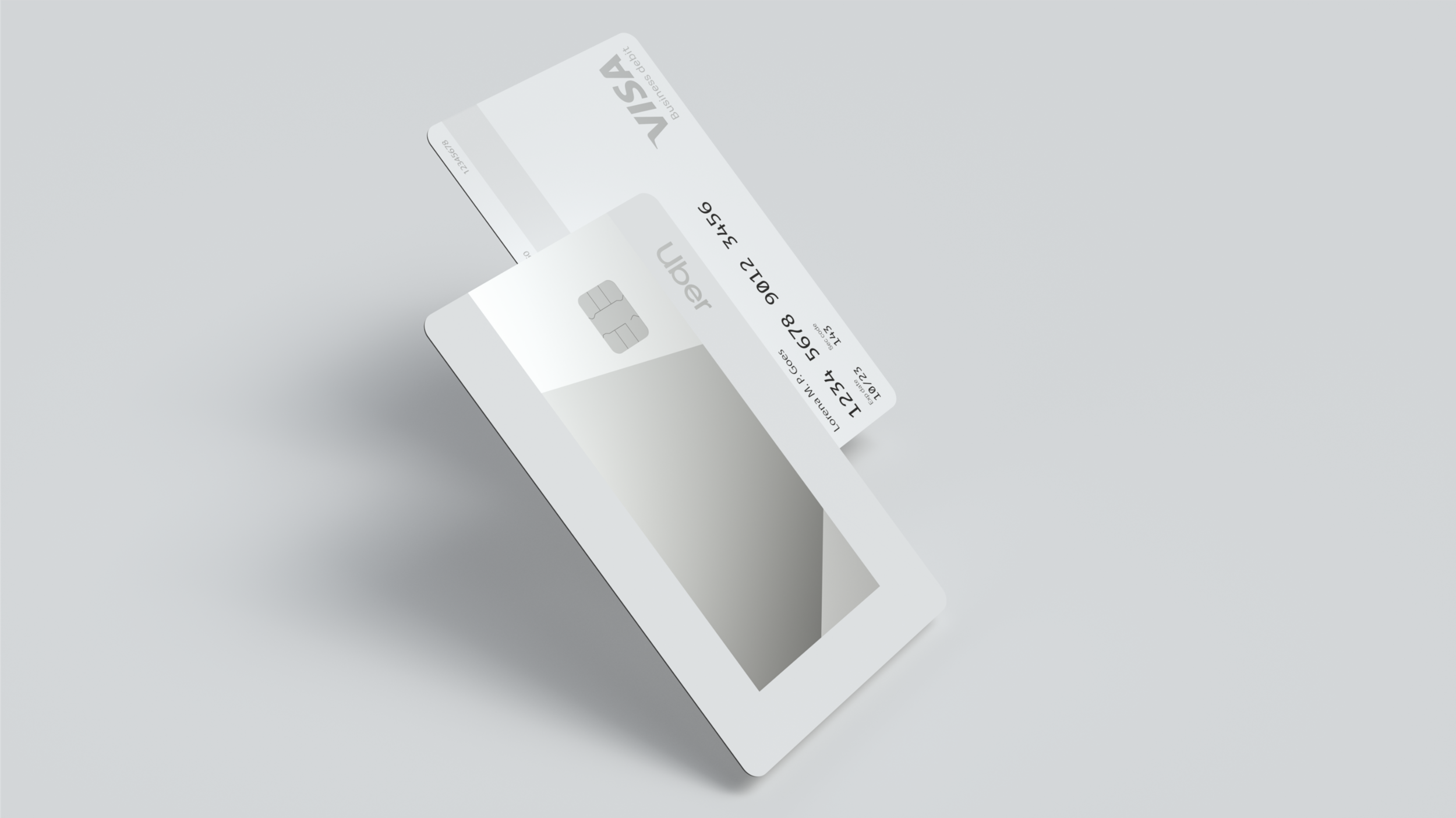
Physical Product
I thrive on translating concept across mediums. Here we took the concept of amplifying opportunity and made it tangible. The physical cards are even more spectacular than the renderings below!

Credits
The work above was led by me and created by the Brand Experience team at Uber in 2019. Braz de Pina and Kevin Funkhouser led the brand design and art direction. April Larivee was the photographer. Aldo Crusher led the illustration efforts. Joan Pons led product design working closely with Didier Hilhorst’s product design team. The Uber Money team was under the guidance of Peter Hazelhurst in collaboration with Laura Jones’ product marketing team, and Carey Head’s creative team. This project was definitely one of the highlights of my time at Uber, it was rare to have this array of talent focussed on getting to launch.